Vivid Visualization| Using Graphs to Illuminate Analytical Problems
Visualization has proven to be key in data science. Data visualization methods vary from simple Excel graphs to network diagrams with customized visuals. These networks help us to understand everything from social media to real-world applications.
Source: Network Visualization
Network Visualization helps us understand the semantics of macro patterns through the use of micro patterns. It symbolizes one possible reality, not the sum of all possible realities. Scientific visualization enhances the questions arising from the data, and the truth of the data is enhanced by the visualization. In turn, this leads us and others to enquire about the data.
Envisioning data through possible filters to reduce its dimensionality can be implemented through unsupervised algorithms, such as clustering algorithms, grouping the nodes by means of similarity, or page ranks that, based on node sizes, signify a single data can have multiple visualization facets. To visualize the link dataset, visualization packages like the open-source Gephi can be used. The size and density of the graph signifies that it shrinks to the specific subset; edge count reduces the graph to significant edges. Node positioning is implemented by the Open Ord layout algorithm and colored by Blondel et al’s modularity, with coloration selected by Gephi.
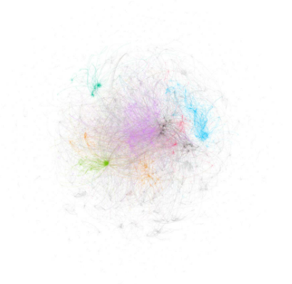
Source : Graph
The Open Ord algorithm utilizes random seed methodologies, each time giving different results. This algorithm results in differences in visualizations on consecutive runs, moving out to one of the best visualizations. It helps to separate the cluster of greatest importance. Changing the background color creates clear separation of the nodes and makes a sharper contrast between the clusters, heightening the impact. Color selection can also change how the user perceives the graph.
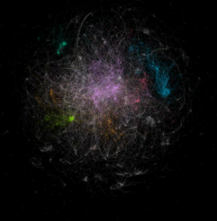
Source : Network
Changing the thickness of the network lines changes the view from micro structure to macro structure. Adjusting the thickness of each edge based on edge strength makes the central core less prominent and emphasizes the isolated nature of small clusters around the boundary.
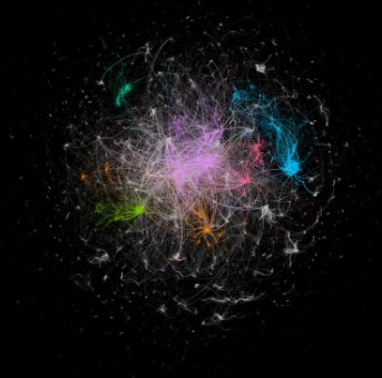
Source : Graph
Graphs are often displayed as edge visualizations, where nodes indicate the focal point of the image. Algorithmic and methodological decisions have a major impact on visual representations.
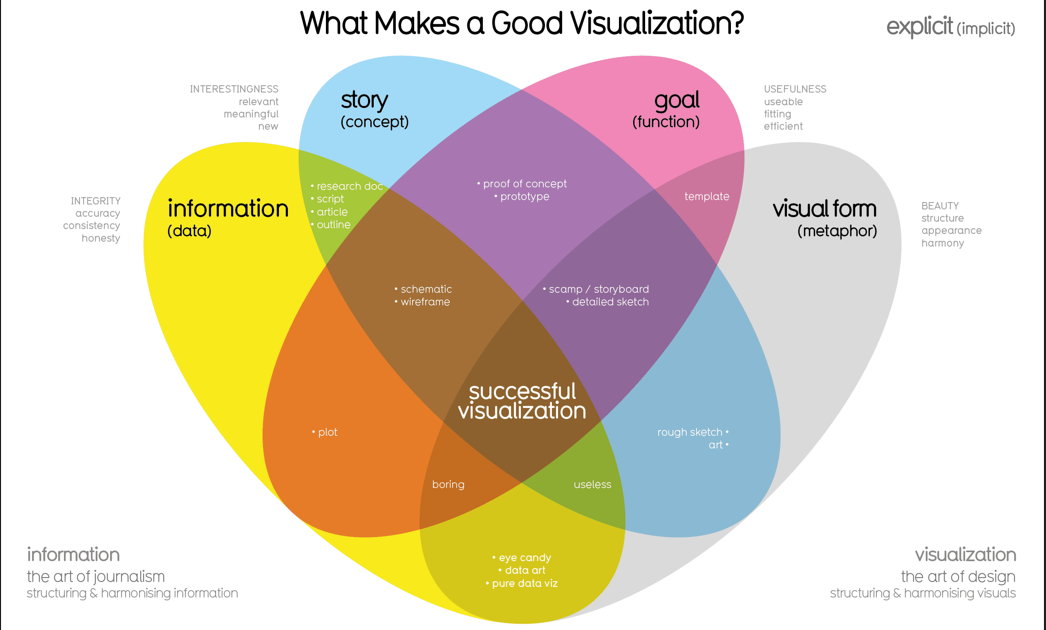
Source : what-makes-a-good-data-visualization
Best Practices for Data Visualization
The overall best practice is to use data visualization to get to the truth of the data.
- The first key is to address the audience and design the visualization according to the audience’s needs, level of understanding, etc. This helps the user to use the data to make business decisions.
- The second key is to understand what each visual signifies and then to choose a visual that is understood by the user. Different types of visuals include line charts, histograms, heat maps, scatter plots, and pie charts (among many others).
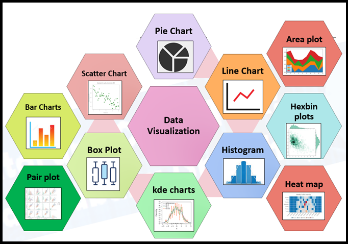
Figure 1: Different Types of Visuals
- Text clarifying the meaning of the visualization should be applied carefully and with due thought.
- Multiple visualization runs should be used; out of these visualizations, the best should be tuned to applications.
- To create the visualization, correct visualization tools must be applied. Top data visualization tools include Tableau, PowerBI, and others.
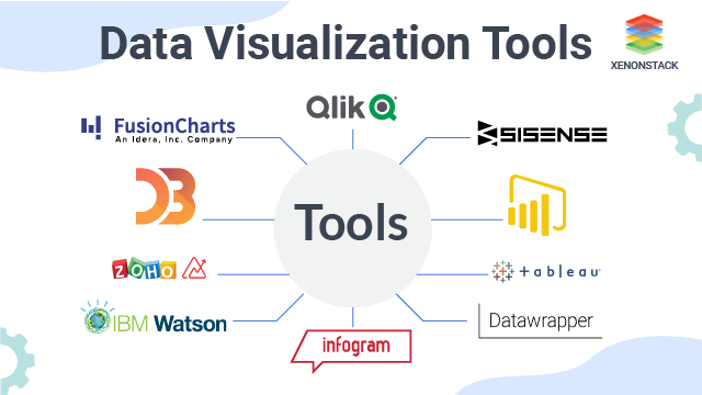
Source: Data Visualization Tools
- The visualization should be enhanced by thoughtful use of color.
- Attractive and intuitive dashboards can also be used to enhance data visualizations.
- Visualization should involve the user.
- Visualization should present meaningful business insights.